Button
A button is an interactive element activated by a user to initiate an action on a page such as submitting a form or opening a dialog.
ARIA-Pattern: Button Pattern
Usage
Buttons are a fundamental building block of any web application. They
enable users to initiate an action by clicking, tapping, or through keyboard
navigation. A button’s label should describe the purpose of the action to the
user. When a button only contains an icon, an accessible description should be
provided to describe the purpose of the action. In most cases, we use the
secondary button variant. Other variants can be used to indicate hierarchy or
semantics of a button’s functionality.
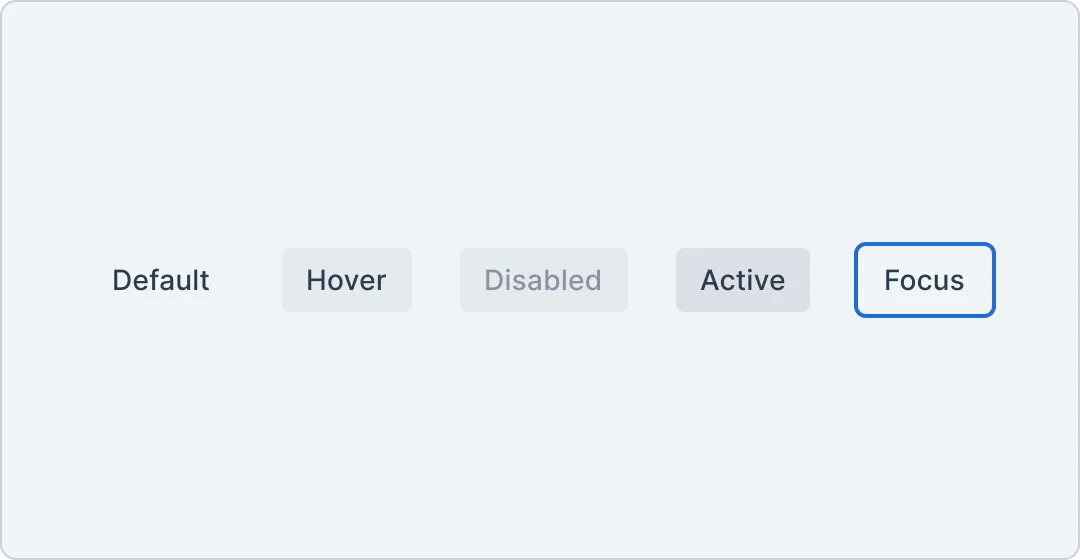
Anatomy

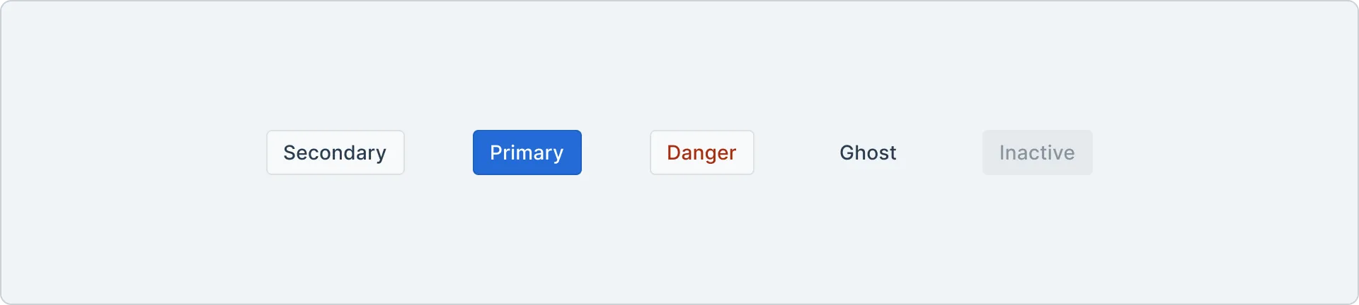
Variants
Primary The primary variant is used to represent the highest priority action on a page. There should at maximum be a single primary button, within a group of buttons, and typically on the whole page.
Secondary The secondary variant is the default for buttons and suitable for more interactions. They can be used on their own, or paired with other variants to perform a secondary action.
Danger The danger variant should only be used to indicate destructive actions. They typically open an alert dialog to confirm the action.
Ghost The ghost variant has a transparent background and translucent hover and active states. It is useful for icon buttons like the close button on a dialog.
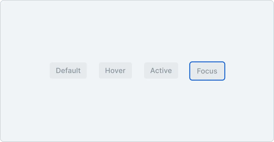
Inactive The inactive variant is an accessible alternative to a disabled button. It is useful for scenarios where buttons should be non-functional, but respond to user input, e.g. a tooltip should be shown when focusing the button.
Tokens
Component tokens are defined for buttons. The tokens are prefixed with button- and define spacing, colors and typography of the button variants.
Spacing
| Token | Output value | Usage |
|---|---|---|
button.spacing.{button.spacing.vertical.sm} | 0.375rem | |
button.spacing.{button.spacing.vertical.md} | 0.5rem | |
button.spacing.{button.spacing.vertical.lg} | 0.625rem | |
button.spacing.{button.spacing.horizontal.sm} | 0.5rem | |
button.spacing.{button.spacing.horizontal.md} | 0.75rem | |
button.spacing.{button.spacing.horizontal.lg} | 1rem |
Colors
| Sample | Token | Output value | Usage |
|---|---|---|---|
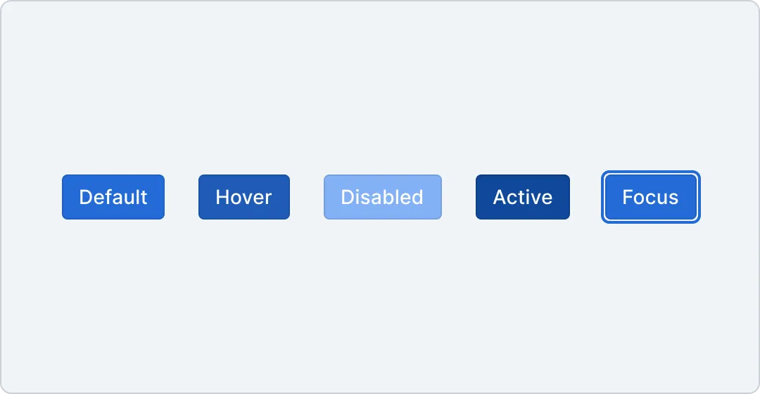
button.color.{button.color.background.primary.default} | #236BD7 | ||
button.color.{button.color.background.primary.hover} | #1F5BB6 | ||
button.color.{button.color.background.primary.active} | #11499C | ||
button.color.{button.color.background.primary.disabled} | #83B1F5 | ||
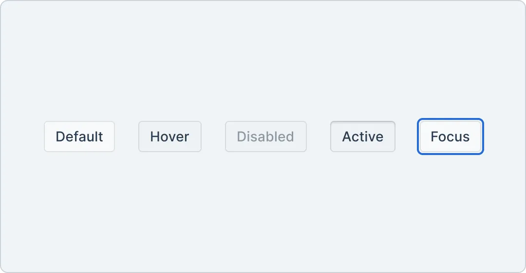
button.color.{button.color.background.secondary.default} | #F7F9FA | ||
button.color.{button.color.background.secondary.hover} | #E5E8EB | ||
button.color.{button.color.background.secondary.active} | #E5E8EB | ||
button.color.{button.color.background.secondary.disabled} | #E5E8EB | ||
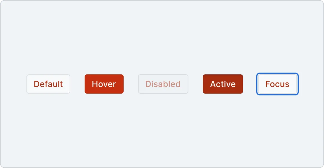
button.color.{button.color.background.danger.default} | #F7F9FA | ||
button.color.{button.color.background.danger.hover} | #C53010 | ||
button.color.{button.color.background.danger.active} | #A72C10 | ||
button.color.{button.color.background.danger.disabled} | #E5E8EB | ||
button.color.{button.color.background.ghost.default} | transparent | ||
button.color.{button.color.background.ghost.hover} | lch(59.952 8.0912 254.3 / 0.1) | ||
button.color.{button.color.background.ghost.active} | lch(59.952 8.0912 254.3 / 0.2) | ||
button.color.{button.color.background.ghost.disabled} | lch(59.952 8.0912 254.3 / 0.1) | ||
button.color.{button.color.background.inactive.default} | lch(59.952 8.0912 254.3 / 0.1) | ||
button.color.{button.color.text.primary.default} | #FFFFFF | ||
button.color.{button.color.text.secondary.default} | #2a3c4f | ||
button.color.{button.color.text.secondary.disabled} | rgba(42, 60, 79, 0.5) | ||
button.color.{button.color.text.danger.default} | #A72C10 | ||
button.color.{button.color.text.danger.hover} | #FFFFFF | ||
button.color.{button.color.text.danger.disabled} | rgba(167, 44, 16, 0.5) | ||
button.color.{button.color.text.ghost.default} | #2a3c4f | ||
button.color.{button.color.text.ghost.disabled} | lch(24.413 14.375 257.85 / 0.5) | ||
button.color.{button.color.text.inactive.default} | lch(24.413 14.375 257.85 / 0.5) | ||
button.color.{button.color.border.primary} | rgba(0,0,0,0.1) | ||
button.color.{button.color.border.secondary} | rgba(0,0,0,0.1) | ||
button.color.{button.color.border.destructive} | rgba(0,0,0,0.1) | ||
button.color.{button.color.border.ghost} | transparent | ||
button.color.{button.color.border.inactive} | transparent |
Border
| Token | Output value | Usage |
|---|---|---|
button.border.{button.border.radius} | 0.25rem |
Typography
| Token | Output value | Usage |
|---|---|---|
button.typography.{button.typography.sm.fontFamily} | Inter | |
button.typography.{button.typography.sm.fontSize} | 0.75rem | |
button.typography.{button.typography.sm.fontWeight} | 500 | |
button.typography.{button.typography.sm.letterSpacing} | 0.0075rem | |
button.typography.{button.typography.sm.lineHeight} | 1.33 | |
button.typography.{button.typography.md.fontFamily} | Inter | |
button.typography.{button.typography.md.fontSize} | 0.875rem | |
button.typography.{button.typography.md.fontWeight} | 500 | |
button.typography.{button.typography.md.letterSpacing} | 0.0075rem | |
button.typography.{button.typography.md.lineHeight} | 1.15 | |
button.typography.{button.typography.lg.fontFamily} | Inter | |
button.typography.{button.typography.lg.fontSize} | 1rem | |
button.typography.{button.typography.lg.fontWeight} | 500 | |
button.typography.{button.typography.lg.lineHeight} | 1.15 |