Color
Colors are one of the primary building blocks of the Enveritas Design System. On this page, you will learn about the patterns and structures of color in the design system.
Getting started
In this section, we will explain the structure of color design tokens and how to apply color tokens for desigining user interfaces.
Color for user interfaces
Colors in the Enveritas Design System are defined and delivered through design tokens. Design tokens are documented design decisions that serve as a single source of truth and make it easier to apply the correct choices.
Structure of color design tokens:
- Base tokens represent a color. Color base tokens are named by color and
lightness, e.g.
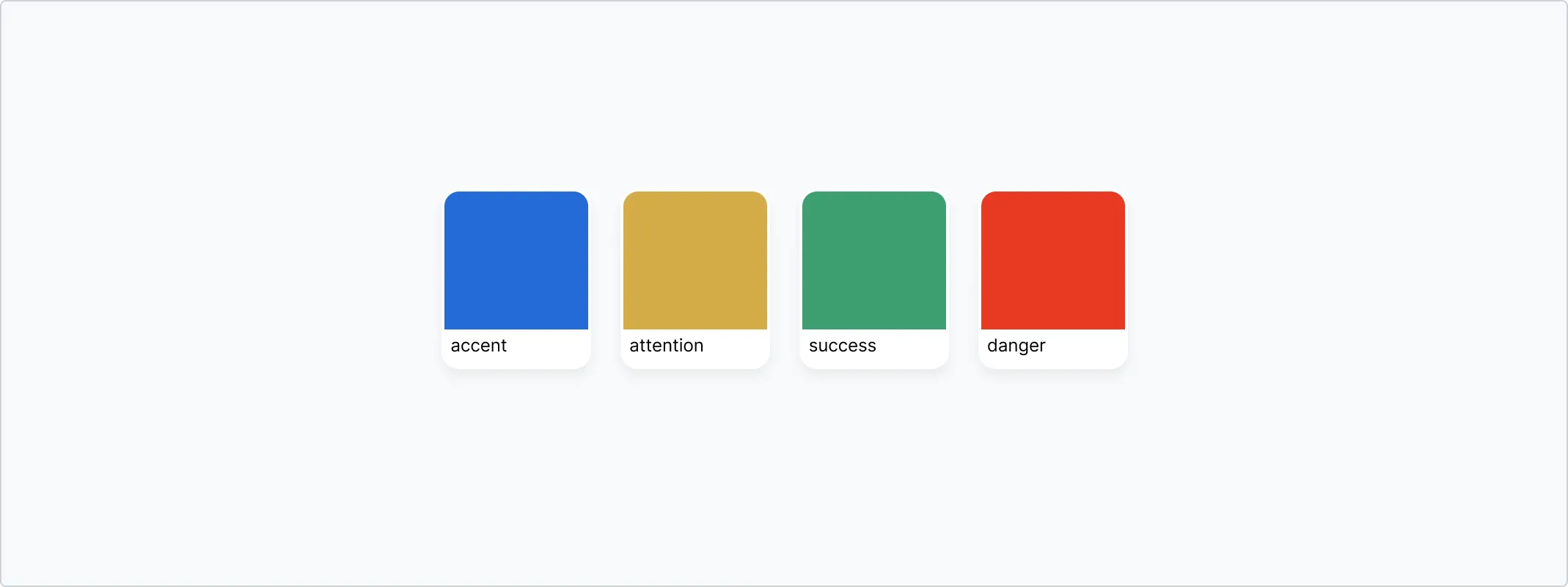
color.gray.100, and support shades from100to800. - Semantic tokens define colors to convey a specific meaning or state.
Semantic tokens include choices for
success,danger,attentionandaccent. - Component tokens represent choices for a specific component. For example,
color.button.background.defaultdefines the background color for a default button component.
As the system grows, more tokens will be defined to document design choices.
Design tokens are stored in the
@enveritas/design-tokens
repository.
Semantic colors
The semantic color system defines colors based on the purpose they have in the user interface. Using semantic colors in design and code to build product interfaces brings some advantages:
- when the underlying tokens or colors change, no additional work is needed to get the updated colors.
- color combinations are based on accessible contrast ratios
Semantic colors are structured into two groups:
-
Foundations: Colors for foregrounds, backgrounds and borders that make up most of the user interface.
-
Color roles: Colors for foregrounds, backgrounds and borders that convey meaning and function in the user interface.
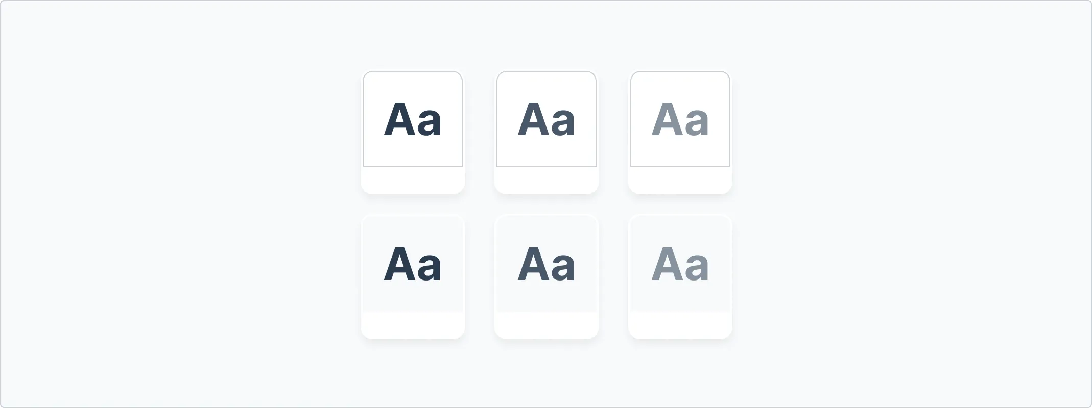
Foregrounds
Foreground colors are designed for text and icons. The colors can be used by
using design tokens that start with color.fg.
| Foundations | |||
|---|---|---|---|
| Sample | Token | Output value | Usage |
fg.default | #2a3c4f | ||
fg.muted | #485768 | ||
fg.subtle | #87929e | ||
fg.onEmphasis | #FFFFFF | ||
| Color roles | |||
|---|---|---|---|
| Sample | Token | Output value | Usage |
fg.accent | #11499C | ||
fg.attention | #775A2B | ||
fg.success | #257951 | ||
fg.danger | #A72C10 | ||
Backgrounds
Background colors are designed background surfaces of components or UI elements.
The colors can be used by using design tokens that start with color.bg.
| Foundations | |||
|---|---|---|---|
| Sample | Token | Output value | Usage |
bg.default | #FFFFFF | ||
bg.subtle | #F7F9FA | ||
bg.inset | #f1f4f7 | ||
| Color roles | |||
|---|---|---|---|
| Sample | Token | Output value | Usage |
bg.accent.regular | #EAF3FF | ||
bg.attention.regular | #FFF8E7 | ||
bg.success.regular | #E8F4EF | ||
bg.danger.regular | #FFEEEB | ||
bg.[ANY_OF_THE_ABOVE].emphasis | |||
Borders
Borders are used to group content or to create a visual separation between two items.
| Foundations | |||
|---|---|---|---|
| Sample | Token | Output value | Usage |
border.default | #cbd1d7 | ||
border.muted | rgb(79.608% 81.961% 84.314% / 0.5) | ||
| Color roles | |||
|---|---|---|---|
| Sample | Token | Output value | Usage |
border.accent.regular | #D3E5FF | ||
border.attention.regular | #FBEABD | ||
border.success.regular | #C9E1D6 | ||
border.danger.regular | #FFCCC1 | ||
border.[ANY_OF_THE_ABOVE].emphasis | |||
Color combinations
Not all colors make a great pair. Combining the wrong colors can make the user interface feel unnatural in the best case, and prevent users from properly being able to see and read the interface in the worst case. The semantic color tokens make it easier to combine the correct colors and comply with the WCAG contrast guidelines.
Pairing color roles
- Do: pair color role foregrounds with their background counterparts, bg.default or bg.subtle.
- Don’t: pair emphasis foregrounds with another emphasis background
Color roles and foregrounds
- Do: use fg.muted with bg.default, bg.subtle and bg.inset
- Don’t use fg.muted on bg.emphasis or any of the color role backgrounds
Color role recipes
Use any of the following combinations for color roles:
![bg.[COLOR-ROLE] + border.[COLOR-ROLE] + fg.[COLOR-ROLE]](/_astro/recipe_1.DxfSVNpV_Z1S0yn6.webp)
![bg.[COLOR-ROLE] + border.[COLOR-ROLE].emphasis + fg.[COLOR-ROLE]](/_astro/recipe_2.DbDCZtsF_Zjxt25.webp)
![bg.default + border.[COLOR-ROLE] + fg.[COLOR-ROLE]](/_astro/recipe_3.CiS1XXx0_19dqL1.webp)
![bg.[COLOR-ROLE] + border.[COLOR-ROLE] + fg.default](/_astro/recipe_4.Df4DVJAz_Z2tgPX8.webp)
Color shades
The design tokens for foregrounds, backgrounds and borders should cover the majority of use cases, though the following shades can be used when designing user interfaces.
Gray
| Sample | Design Token | Output Value |
|---|---|---|
gray.100 | #F7F9FA | |
gray.200 | #E5E8EB | |
gray.300 | #cbd1d7 | |
gray.400 | #a8b1ba | |
gray.500 | #87929e | |
gray.600 | #667483 | |
gray.700 | #485768 | |
gray.800 | #2a3c4f |
Blue
| Sample | Design Token | Output Value |
|---|---|---|
royalblue.100 | #F4F8FD | |
royalblue.200 | #EAF3FF | |
royalblue.300 | #D3E5FF | |
royalblue.400 | #83B1F5 | |
royalblue.500 | #639BF0 | |
royalblue.600 | #236BD7 | |
royalblue.700 | #1F5BB6 | |
royalblue.800 | #11499C |
Yellow
| Sample | Design Token | Output Value |
|---|---|---|
vividyellow.100 | #FEFBF4 | |
vividyellow.200 | #FFF8E7 | |
vividyellow.300 | #FBEABD | |
vividyellow.400 | #EDD087 | |
vividyellow.500 | #E5BC54 | |
vividyellow.600 | #D5AC47 | |
vividyellow.700 | #BD942E | |
vividyellow.800 | #775A2B |
Green
| Sample | Design Token | Output Value |
|---|---|---|
green.100 | #F5FAF8 | |
green.200 | #E8F4EF | |
green.300 | #C9E1D6 | |
green.400 | #7EBD9F | |
green.500 | #5AAC85 | |
green.600 | #3C9F70 | |
green.700 | #348C62 | |
green.800 | #257951 |
Red
| Sample | Design Token | Output Value |
|---|---|---|
vividred.100 | #FFF8F7 | |
vividred.200 | #FFEEEB | |
vividred.300 | #FFCCC1 | |
vividred.400 | #FA937C | |
vividred.500 | #F17459 | |
vividred.600 | #E73A22 | |
vividred.700 | #C53010 | |
vividred.800 | #A72C10 |